Saturday, 14 May 2016

Instagram

As part of our last task of the assignment, apart of the creation of an actual website, we had to choose a section from Instagram and code it to make our own Instagram version of that particular section. In my case I chose the Sign Up section of Instagram, and below you can find parts of the code in both HTML and CSS, and the final result.

Part of the HTML Code
Part of the CSS Code
Original Sign up Page
My Version Sign up Page
N.B- This is my final result; can't submit the material, as the file was deleted/corrupted. (This was discussed in class.)

More Coding......

Since we did the HTML and CSS code introduction, we continued to learn new code in both HTML and CSS, and with it we were able to start creating new things for a website. We created a Blog, and a Contact Form which had a drop-down menu selection, and a file selection with the Choose File feature.

Blog Page

Contact Form

Friday, 8 April 2016

Task 2: Specifications and Design - (Style Guide)

4. Style Guide

  • 3. An information section containing general information on the entities, events and collaborative efforts between Valletta and Leeuwarden. 

  •  4. A submission for with which an individual cans submit proposals for new projects.

  •  5. A messaging platform with which users can correspond with each other.

Task 2: Specifications and Design - (Functional and non-functional elements)

3. Functional and non-functional elements

Here you can find all the functional and non-functional elements for every section chosen:

  • 3. An information section containing general information on the entities, events and collaborative efforts between Valletta and Leeuwarden.

Apart from the Menu Bar Buttons and the Scroll Bar there are no functionality elements in these pages.
  •  4. A submission for with which an individual cans submit proposals for new projects.

For the Submission Form the functionality elements are: Menu bar (which is functional from every page/section), in the empty boxes the user needs to type in the information, attach file is a button which enable the user to attach any files he wishes.
On the other side the Review Proposal page's functionality element is that each proposal can be clicked to be opened for more information.
  •  5. A messaging platform with which users can correspond with each other.

For the Inbox the functionality elements are: User log in (Name, Surname and picture) can be clicked so the user's profile will be opened, and the messages can be clicked to be opened.
For the Message Thread the functionality elements are: 
 in the empty boxes the user needs to type in the information,  attach file is a button which enable the user to attach any files he wishes to, other buttons so the user can be able to change the font type and add any emoji, and the send button that enables the user to send the email.

Thursday, 7 April 2016

Task 2: Specifications and Design - (Wireframe Layouts)

2. Wireframe Layouts - Thumbnail Sketches

Here you can find thumbnail sketches for every section chosen:

  • 3. An information section containing general information on the entities, events and collaborative efforts between Valletta and Leeuwarden.

  •  4. A submission for with which an individual cans submit proposals for new projects.

  •  5. A messaging platform with which users can correspond with each other.

Task 2: Specifications and Design - (Sitemap)

1. Sitemap

In this post you can see a sitemap of the website which includes the three chosen sections which are:
  • 3.  An information section containing general information on the entities, events and collaborative efforts between Valletta and Leeuwarden.
  • 4. A submission for with which an individual cans submit proposals for new projects.
  • 5. A messaging platform with which users can correspond with each other.
Website Sitemap

Monday, 21 March 2016

Coding Introduction

This exercise consisted in the introduction of both HTML and CSS code.

First we started with some basic HTML code:


Above there is a screen shot of the first code we did. Over here we were introduced how to do a title (what is going to be written on the tab of the browser), the header of the website, how to put an image with alternative text to it, how to write normal content and finally how to do a hyper-link.


After that we were asked to do a similar exercise but more personalized, and to do the hyper-link within the image.

The day after we were introduced to the CSS code:


After we did a new HTML code/page we started to arrange that content by CSS. In this stage we were taught how to change the font type and size, how to align the text, how to change a background colour, how to do a border, how to arrange the position of a specific part of content with the margin, padding and overflow and finally how to section different parts by given them an ID name.

Thursday, 3 March 2016

Accessibilty

For this exercise we had to check if the website we chose (in my case www.imdb.com) has accessibilities, so user with any disabilities could use it also, and even if something goes wrong in the actual content of the website, the user still will be ale to know what he is supposed to see or watch.

To do so we used the WebAIM Checklist which included several guidelines which helped us determine whether or not the website we chose is accessible or not.

Here I'm going to talk about some of the guidelines listed, starting with the first guideline; "Text Alternatives: Provide text alternatives for any non-text content". The imdb website has no text alternatives and this could been noticed when the images were disabled no text replaced them to show what's supposed to be there.
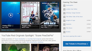
Images Visible

Images Disabled

Another guideline is; "Adaptable: Create content that can be presented in different ways (for example simpler layout) without losing information or structure". The imdb website is adaptable as everything is sectioned and titled, and that makes it easier to read the content, even if the layout would be a subject to change.

Another guideline that I found this website has, is; "Distinguishable: Make it easier for users to see and hear content including separating foreground from background". Regarding colour only black is used for the text, blue for the links and all of this is set on a light grey background, making it easy for the user to read.


Another guideline is; "Keyboard Accessible: Make all functionality available from a keyboard". Although it is a bit complicated and takes some time to be done, this guideline is also covered by this website.

Above I mentioned some of the few guidelines the imdb website has or not, that makes it accessible; all this could be done thanks to the WebAIM Checklist which can be found here: http://webaim.org/standards/wcag/checklist

Frameworks

The website I'm working with (www.imdb.com) has one of the simplest framework one can use; and that is the 960 Grid System. Basically this type of framework uses a grid system based on a width of 960 pixels, and all the information will be put in that area. With this method the content won't be responsive to the window, that means if the size of the window is changed the content will stay in the same place, it won't move regardless the size of the window.

Probably this kind of framework is used because of the kind of content the website has; videos, images, lists, and text, so all these won't change its place, because it might not make sense.

A framework that I found is the CodeIgniter Rocks. It is a framework that when the size of the window is changed, the content of the website will change its position in a way that the website still looks elegant.


This type of framework may be applied to the IMDB website because as I said before when the size of the window is changed the content still be kept in an elegant position.

Wednesday, 24 February 2016

Draw a Webpage

For the first part of this exercise we had to draw the homepage of the desktop version of Facebook's website from memory without looking at the website before or while we are drawing. Here is the result:


For the second part of the exercise we had to draw the homepage of the Times of Malta website after we look at it for about 2 minutes, to memorize it. Here is the result:


For the first drawing, I left some things out and its not because it was difficult to remember them in the way they are but because usually I don't notice how those things are, I just use the website. Also it was from my memory and consider that, I didn't left much, infect the other one that first I could see it and then draw it, I draw everything from it.
Therefore for me both websites are designed good and in a way that is good to remember. 

Wednesday, 17 February 2016

Changes in Design of a Website


The website I chose to check for changes in its design is www.imdb.com.

Since the first time it was launched till now this website had a drastics changes in its design.

The first thing I noticed is, that the logo had a very minimal changes to it, infect the only changes I noticed are the border and by time they made it more visible by making it a bit larger then before.


In 2000 the website was basically full of text (information about the movie) with the poster of that particular movie small on the side.


By time the website starting to transform itself in how it is today. In 2010 the website main colours were changed and the structure was changed also with the text is kept to the minimum and the images were given more importance.


In today's website it is basically the other way round as it was in the beginning when it was launched, where the posters of the movies/images are the main thing you see as they are large and the text is put in minimal way, not as it was before, everything in each other and confusing.