To do so we used the WebAIM Checklist which included several guidelines which helped us determine whether or not the website we chose is accessible or not.
Here I'm going to talk about some of the guidelines listed, starting with the first guideline; "Text Alternatives: Provide text alternatives for any non-text content". The imdb website has no text alternatives and this could been noticed when the images were disabled no text replaced them to show what's supposed to be there.
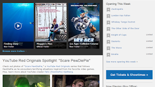 |
| Images Visible |
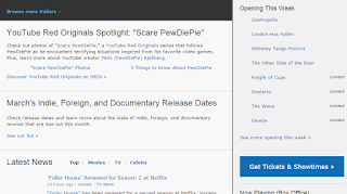 |
| Images Disabled |
Another guideline is; "Adaptable: Create content that can be presented in different ways (for example simpler layout) without losing information or structure". The imdb website is adaptable as everything is sectioned and titled, and that makes it easier to read the content, even if the layout would be a subject to change.
Another guideline that I found this website has, is; "Distinguishable: Make it easier for users to see and hear content including separating foreground from background". Regarding colour only black is used for the text, blue for the links and all of this is set on a light grey background, making it easy for the user to read.

Another guideline is; "Keyboard Accessible: Make all functionality available from a keyboard". Although it is a bit complicated and takes some time to be done, this guideline is also covered by this website.
Above I mentioned some of the few guidelines the imdb website has or not, that makes it accessible; all this could be done thanks to the WebAIM Checklist which can be found here: http://webaim.org/standards/wcag/checklist


